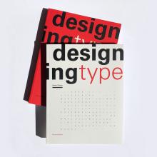
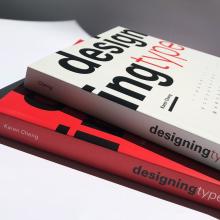
Fourteen years after the first edition was published, Professor Karen Cheng is releasing the fully revised second edition of her widely known book Designing Type. The American publisher of both books is Yale University Press, and Laurence King Publishing is the British publisher for the two editions.
In preparation for the October 20 debut of the second edition, we asked Cheng a few questions and received thought-provoking answers:
Why did you write this book?
In the late 1990s / early 2000s, there was a clear gap in the design literature. There were plenty of books on typography (the art and craft of setting type to convey meaning and messages), but very few books about designing typefaces. There were some historical surveys about the development of type (such as Letters of Credit by Walter Tracy), and there were books about lettering (such as Lettering for Reproduction by David Gates), but no books on “how to design a font” existed. I think the first book that really focused on contemporary type design was probably Doyald Young’s Fonts & Logos, which was published in 1999. It is a beautiful book but more of a monograph detailing Young’s specific approach and philosophy.
Like any first-time author, I greatly underestimated the effort it would take to research and write a book. At the time, the concept seemed simple: I would go letter by letter (i.e., Bird by Bird) and show the main constructions for each glyph. I was already teaching type design and had produced quite a number of diagrams and illustrations for my class, so it seemed logical to put them together into a book.
There are now a few more books on type design, but it is still an underserved subject. Sofie Beier has written two good books, Reading Letters and Type Tricks; Joep Pohlen wrote Letter Fountain; and the late Dutch type designer Gerard Unger wrote the wonderful Theory of Type Design. I think an excellent book for students is How to Create Typefaces: From Sketch to Screen, which is written by three type designers: Cristóbal Henestrosa, Laura Meseguer, and José Scaglione. There is a nice review on Alphabettes.org that notes that Designing Type and How to Create Typefaces are good companions.
What changed between the first and second editions?
I am very pleased that the first edition has been well received (it is used widely as a design textbook), and I am amazed that it has been translated into non-Latin languages such as Chinese and Korean. However, like all authors, I received some criticism, especially in the specialized online forums for type designers.
Many type designers noted the omission of calligraphy (broad-nib and pointed pen writing is the foundation for many classic typeface designs). Additionally, several readers felt that I had inadequately explained the type design process, especially the motivations for producing a new typeface (why make a new typeface when there are literally thousands already?). Another criticism was that the book should show type in greater context — how the design of letters impacts typesetting and typography.
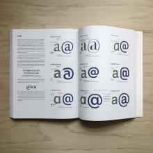
I have tried to address these critiques by including or expanding information on these topics. For example, I have written a new chapter that puts the broader, more general issues of type design together in one place — i.e., x-height, weight, serif shapes, etc. I have also included two case studies of student type projects that more clearly demonstrate the type design process. Additionally, for each character, I have shown glyphs in words or text, so it is easier to see how design decisions at the micro-level can impact typesetting and typography at the macro-level. Of course, technology has changed dramatically in the last fifteen years, so that had to be updated as well.
Perhaps the most enjoyable part of revising the book was selecting new typefaces for inclusion. You would think that all the design possibilities for typefaces would be exhausted by now (after all, Gutenberg’s press dates back to 1440), but every year there are still beautiful new typefaces and novel approaches.
As a side note, it was quite interesting getting in touch with new type designers. When I purchase fonts, I generally try to buy from the original designer as opposed to an aggregator like Fonts.com (it’s a bit like buying a CD from the musician at their show; you know that your funds are fully supporting the artist as opposed to enriching Spotify or Apple Music). I was a bit taken aback that several type designers wrote back and asked if I was the author of Designing Type. These young designers — usually in their 20s or 30s — would often tell me that it was their first book on type design. It is a bit shocking to realize that an entire new generation of type designers has grown up between the first edition and this new edition.
Are there plans for non-English versions of the second edition?
In addition to English, the first edition was published in five languages: German, Spanish, French, Chinese, and Korean. The European languages sold out, but the Spanish rights were repurchased, and a new version was published in 2019 with a useful spiral binding.
A Japanese version of the second edition will be published in the first half of 2021 by Graphic Sha. A simplified Chinese language version will be released in January 2022 by Tianjin IFengSpace Media Company.
The American and British second editions will also be published as e-books for the first time. Due to COVID-19, the publishers thought that e-books would be more accessible.
Update
November 2020
Cheng was interviewed about this book by The League of Moveable Type for their Weekly Typographic Podcast. Listen to it on:


