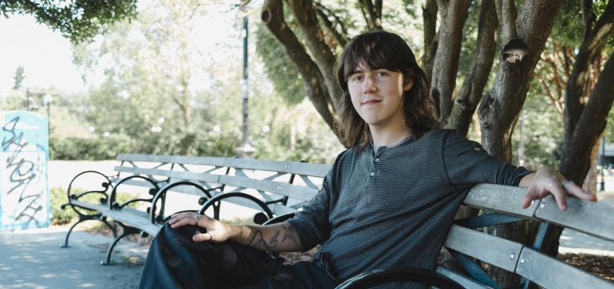

Fonts shape our world in quiet ways—on screens, in books, across cities. Most of us never wonder where they come from. Burke Smithers (BDes 2024) was no different—until a design class at UW introduced him to the intricate, expressive world of typeface design.
Smithers’ lifelong passion for art and illustration motivated him to apply to the Visual Communication Design (VCD) program at the UW School of Art + Art History + Design. When he entered the program, he knew little about typography. It wasn’t until his sophomore year, in the introductory Typography course, that he encountered the subject. At first, he saw typefaces as simply existing resources to be used and manipulated by designers. He didn’t feel particularly drawn to them. In fact, the technical precision of typography made it seem daunting and difficult. He assumed it would be an area he would struggle with as a designer.
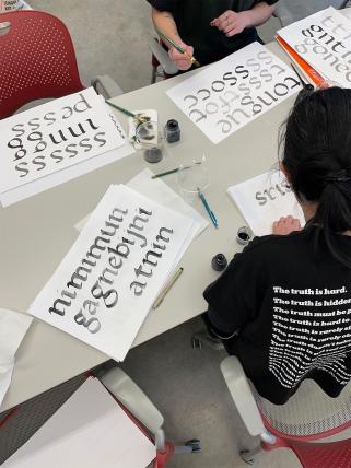
That perception changed when he took Marks & Symbols, taught by Professor Karen Cheng, later that year. In the class, students design their own typeface inspired by an existing one. For Smithers, this was a turning point—he realized that creating type could be an expressive, artistic process, and that he could develop a type family infused with his own vision and style.
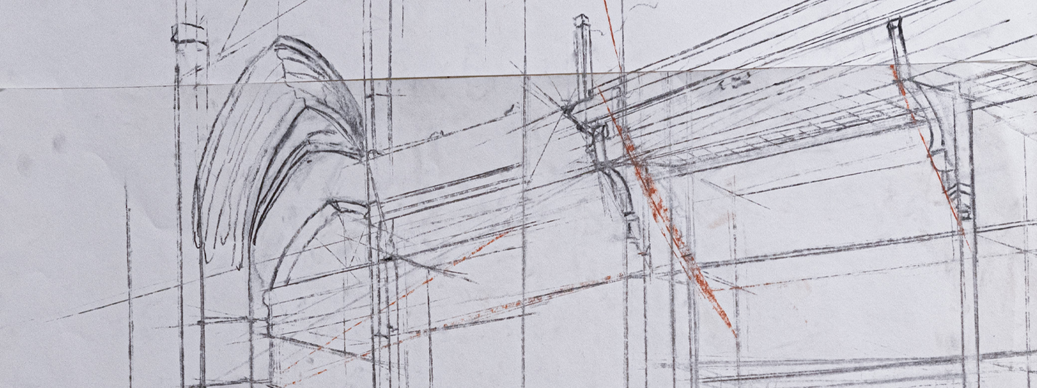
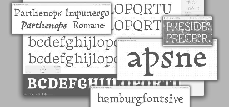
In the summer before his senior year, Smithers attended Type@Cooper, a prestigious five-week intensive program in typeface design at Cooper Union in New York. The experience deepened both his technical skills and his passion for typography. When it came time to develop his senior capstone, the decision to create a typeface felt instinctive. The result was Phylum, a typeface inspired by the old-growth forests of Washington state. The project won a 2025 Young Ones TDC Award—one of the most respected competitions in the type design world.
After graduating with a Bachelor of Design in 2024, Smithers embarked on what he describes as a “challenging” start to his career. He has taken on a variety of freelance work, from a six-month contract role with Ambrook, to collaborative projects with numerous clients, including Studio Matthews, led by VCD professor Kristine Matthews. Most recently, he completed a three-month internship in Paris with Typofonderie, the award-winning studio of renowned type designer Jean François Porchez. The internship opportunity was made possible thanks to a long-standing relationship between Porchez and the UW Design program (read about a previous collaboration).
Though freelancing has its obstacles, Smithers feels well-prepared thanks to the rigor of the UW Design program. “Freelancing is hard, but being exposed to different projects and work environments has been rewarding,” he says, “but I am ready for something different”. He recently returned to Seattle in June from Paris and is juggling freelance projects while updating his portfolio and applying for full-time roles—ideally landing a junior designer position soon.
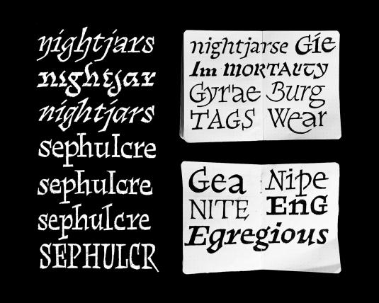
His time in Paris also pushed him to pursue something he had been considering for a while: launching his own independent type foundry. Named Nightjar Type, after the first typeface he ever designed in 2023 (inspired by his love of birds and the natural world), the foundry now features three of Smithers’ original typefaces available for purchase at nightjartype.xyz. “There’s a lot I can still improve on,” Smithers says, “but I figured I should just put it out there.” It’s a lesson he credits to his design education: that creative work often never feels “done”—but at some point, you have to define your own limits and release it into the world.
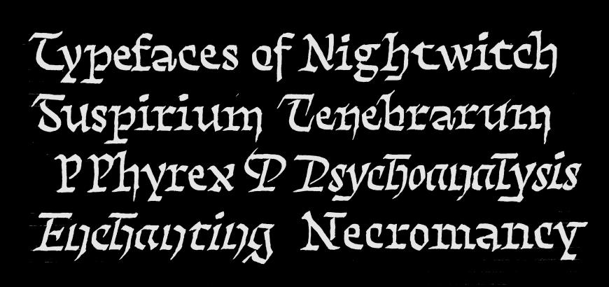
A strong environmental theme runs through Smithers’ portfolio and type foundry. “The design program trained us to embed our own interests into our work,” he explains. One standout example is Forgotten Worlds, a 250-page student publication inspired by his birdwatching hobby, which began during the pandemic—around the same time he started at UW. Smithers’ environment-inspired fonts convey a distinct, grungy visual language that gives his work a recognizable edge. “My hope,” he says, “is that putting my interests out there will eventually attract projects that align with those same values.”
You can see Burke’s work at burkes.studio.